


Cover image: Printer press, s. XVI
If I had to stay with just one of the most exciting moments from the birth of Cuerdas Pulsadas , it would certainly be the moment when We decided on the final version of the logo. We always had a fairly precise idea of how we wanted the image of Cuerdas Pulsadas to be and, right from the beginning, we tried to take care of all the little details.
In this way, the logo has been our main brand of identity. An effort to condense an idea, a project and a passion.
 A capital part of this brand image is undoubtedly owed to the extraordinary work of David Hernández , with whom we contacted in the earliest stages of the conception of Cuerdas Pulsadas to inquire about his work.
David Hernández has combined for years two of his hobbies that, although separately they may be exotic, their union is already an extraordinary phenomenon. Thus, in idle time, his passion for music and his interest in calligraphy combine, combining the self-taught learning of the plucked string and historical typography.
Through years of work, David has managed to reconstruct and digitize a good part of the main manuscript heritage of the plucked string work. A very extensive, meticulous and demanding work that he has always developed with the humility that characterizes him.
The result of this enormous work has been used extensively in the also exquisite publications of the Sociedad de la Vihuela , already being an inherent characteristic of its publication style.
And here we come back to the Cuerdas Pulsadas logo, where we proudly use one of the fonts made by David: a unique and differentiating element with which our image has finished defining itself.
We appreciate (publicly too) your selfless contribution to this project, and we are very happy to be able to count on your collaboration on this blog in the form of this interesting interview.
David Hernández Romero was born in Huelva forty-one years ago and studied Geography and History, a specialty in Art History, between the faculties of Huelva and Seville.
In 2006, after eight intense years as an interim teacher, he managed to get a high school place in his specialty and since then he has taught at various institutes in the Los Pedroches region (north of Córdoba), especially in the town where he resides. Villanueva de Córdoba.
We leave you with the interview with David:
A capital part of this brand image is undoubtedly owed to the extraordinary work of David Hernández , with whom we contacted in the earliest stages of the conception of Cuerdas Pulsadas to inquire about his work.
David Hernández has combined for years two of his hobbies that, although separately they may be exotic, their union is already an extraordinary phenomenon. Thus, in idle time, his passion for music and his interest in calligraphy combine, combining the self-taught learning of the plucked string and historical typography.
Through years of work, David has managed to reconstruct and digitize a good part of the main manuscript heritage of the plucked string work. A very extensive, meticulous and demanding work that he has always developed with the humility that characterizes him.
The result of this enormous work has been used extensively in the also exquisite publications of the Sociedad de la Vihuela , already being an inherent characteristic of its publication style.
And here we come back to the Cuerdas Pulsadas logo, where we proudly use one of the fonts made by David: a unique and differentiating element with which our image has finished defining itself.
We appreciate (publicly too) your selfless contribution to this project, and we are very happy to be able to count on your collaboration on this blog in the form of this interesting interview.
David Hernández Romero was born in Huelva forty-one years ago and studied Geography and History, a specialty in Art History, between the faculties of Huelva and Seville.
In 2006, after eight intense years as an interim teacher, he managed to get a high school place in his specialty and since then he has taught at various institutes in the Los Pedroches region (north of Córdoba), especially in the town where he resides. Villanueva de Córdoba.
We leave you with the interview with David:
 At the moment there are no more publications that use my fonts, although to tell the truth there is another project in the making that will surely do so in the near future. There is also the website for La Bellemont , along with their wonderful first album, and some pages plus.


 Saldívar
A beautiful font in honor of the calligraphy of Santiago de Murcia, which, once regularized, has turned out to acquire a certain touch of additional elegance, especially in really showy capital letters.
Saldívar
A beautiful font in honor of the calligraphy of Santiago de Murcia, which, once regularized, has turned out to acquire a certain touch of additional elegance, especially in really showy capital letters.
 And so far the relationship, waiting to be able to materialize other projects that at the moment I only have in mind, although in parallel to the design of these fonts I have also been making adaptations of them (and additional creations) for the two main editing programs of tablatures, the Django and the Fronimo.
 Knowing this, Javier told me about a manuscript of baroque music that, after having survived a fire and other vicissitudes, could be calligraphically reconstructed and subsequently published.
The truth is that we never agreed to carry out the project (possibly due to lack of time, given the insistence with which I proposed it) and I do not even have the exact reference of the battered manuscript, but the truth is that thereafter, convinced that at least this way I could edit any tablature much faster without completely renouncing the beauty of the old, I set out to design the necessary fonts to reproduce the writings of the Folger and Dresden manuscripts, which were the that first came to my hands.
In addition, Patt himself provided all the students with a large corpus of facsimiles of books for baroque lute that only added fuel to that dream of publishing old-fashioned tablature.
Knowing this, Javier told me about a manuscript of baroque music that, after having survived a fire and other vicissitudes, could be calligraphically reconstructed and subsequently published.
The truth is that we never agreed to carry out the project (possibly due to lack of time, given the insistence with which I proposed it) and I do not even have the exact reference of the battered manuscript, but the truth is that thereafter, convinced that at least this way I could edit any tablature much faster without completely renouncing the beauty of the old, I set out to design the necessary fonts to reproduce the writings of the Folger and Dresden manuscripts, which were the that first came to my hands.
In addition, Patt himself provided all the students with a large corpus of facsimiles of books for baroque lute that only added fuel to that dream of publishing old-fashioned tablature.
A capital part of this brand image is undoubtedly owed to the extraordinary work of David Hernández , with whom we contacted in the earliest stages of the conception of Cuerdas Pulsadas to inquire about his work.
David Hernández has combined for years two of his hobbies that, although separately they may be exotic, their union is already an extraordinary phenomenon. Thus, in idle time, his passion for music and his interest in calligraphy combine, combining the self-taught learning of the plucked string and historical typography.
Through years of work, David has managed to reconstruct and digitize a good part of the main manuscript heritage of the plucked string work. A very extensive, meticulous and demanding work that he has always developed with the humility that characterizes him.
The result of this enormous work has been used extensively in the also exquisite publications of the Sociedad de la Vihuela , already being an inherent characteristic of its publication style.
And here we come back to the Cuerdas Pulsadas logo, where we proudly use one of the fonts made by David: a unique and differentiating element with which our image has finished defining itself.
We appreciate (publicly too) your selfless contribution to this project, and we are very happy to be able to count on your collaboration on this blog in the form of this interesting interview.
David Hernández Romero was born in Huelva forty-one years ago and studied Geography and History, a specialty in Art History, between the faculties of Huelva and Seville.
In 2006, after eight intense years as an interim teacher, he managed to get a high school place in his specialty and since then he has taught at various institutes in the Los Pedroches region (north of Córdoba), especially in the town where he resides. Villanueva de Córdoba.
We leave you with the interview with David:
David, how do these two hobbies come together in your life and how do you combine them with your professional career?Along with my profession, teaching, is my other great vocation, the plucked string. The relationship that I have maintained for so many years with the Renaissance lute and later with the Baroque is not due to an official or complete training, but to a kind of passion that, simply, I have not been able to abandon despite the abundant moments of frustration that this forced self-learning provokes. Perhaps partly due to these shortcomings, over the last few years I have been developing a parallel and complementary activity to the lute: historical typography, although not in this case in a professional way. It is simply a hobby that, from a very young age, I have always had towards the world of calligraphy, and that thanks to computer technology I have tried to channel towards the creation of fonts with a more or less historicist character, extracted from printed books or manuscripts ancient. From there, the design of types for the edition of tablature books did not require more than a small leap, reflected in my semi-annual collaboration -since 2008- with the publication of the musical offprint of Hispanica Lyra, in addition to the occasional project parallel in the same area. But I clarify that in no way could he be considered a professional of typographic design nor, of course, of historical interpretation. I am nothing more than a high school teacher who is divided among certain hobbies, no matter how much devotion (which is a lot) that I put into the matter.
David, how do you face the extraction of a new typeface? What supports do you usually have to undertake this work?To carry out this work, I simply start from one of the PDF files that abound on the web, which can be freely downloaded and easily converted to some type of editable image. If you had to obtain the original figures of a paper facsimile, you would have to scan its pages first, so it is preferable to have the computer equivalent directly, unless its low resolution is not enough to achieve minimally sharp profiles.
Once you have sufficient quality support, how does your work develop? How do you manage to make a complete alphabet from a font that can be partial?Once the base file is located, the isolation phase of each of the characters that will make up the new font begins. It is hard work, which consists of tracing, page by page and line by line, the most significant example of all graphic signs: the best a, the best be, the best four, the best opening parenthesis, etc. There are times when it is easy to distinguish one sign from others, but at other times I have to choose between two that are equivalent but with different lines, as is often the case with short ese and long ones; in these cases I make readability for the modern reader prevail over historical design, although it is quite difficult to get rid of certain really beautiful type variants. After a good load of hours of work I have already selected most of the letters and numbers, but the problem remains of how to design on my own those signs of our modern alphabet that do not appear in the original manuscript or book: for example, the capital j, the capital u or any other of little use, such as the double vee. To do this, I usually copy that same character from some other similar font and dissect it in all its straight and curved lines, so that they can be individually replaced by other equivalents that come from the font under construction, taking care that the inclination and thickness of the added are consistent with the rest of the lines: in short, a whole surgical task. Once the letters and numbers are finished, I start with the punctuation marks and other complementary ones, usually easier to design (with the exception of the happy question marks).
At that time you already have a complete alphabet, reconstructed from the original source, what else is there to do?With the font already on track, it’s time to try all kinds of combinations between pairs of letters and sequences of words so that, simulating phrases, they can be adjusted in their height, thickness and inclination. It would be something like the testing and retouching phase for the whole font, rather than for the characters themselves. And it is that if, when writing entire paragraphs, you do not get a feeling of going back to the past, with a credible ductus that somehow reproduces the way you move your hand on paper, your work will simply have remained half. This is something that I have only been getting in my latest sources, which explains why I am continually tweaking my first designs to incorporate these tweaks.
David, what software tools do you have to develop your work?The first application necessary to carry out the process is a good image editor, with which you can change the resolution of the images imported from the PDF, trim the selected characters and modify, through filters and level adjustment, the thickness of the strokes, which should stand out on a clear and clean background. I personally resort to Adobe Photoshop, although, for example, the GIMP performs the same tasks perfectly. But the fundamental utility is the font editor. Although I also have FontLab Studio to carry out certain tasks, for me the reference is the High-Logic FontCreator, which, once the blank template that will serve as the basis for the new font has been created, allows importing, one by one, all the characters that we have been isolating and retouching in the image editor. To do this, you just have to paste them in their corresponding cells, although most of the work is to equalize the inclination and the thickness of all the elements of the font, as I explained previously.
We know that the demanding quality and excellent edition of the publications of the Sociedad de la Vihuela have your fonts, but can you tell us what uses have been given to your fonts?The main use that from the beginning I have given to the sources is none other than the purely personal. But since I joined Hispanica Lyra I have always tried to give it that characteristic historicist aspect with the systematic use of my designs, and in fact on several occasions the font used was created expressly for that number, although it is also true that in two Sometimes I took advantage of other people’s fonts of free use. Apart from that, I had the opportunity to contribute with the typographic design in the recent book by Francisco Valdivia dedicated to Santa Cruz, and obviously in the compilation of tablatures that Gabriel Fernández and myself published last year in the Sociedad de la Vihuela , Canto Bello.
At the moment there are no more publications that use my fonts, although to tell the truth there is another project in the making that will surely do so in the near future. There is also the website for La Bellemont , along with their wonderful first album, and some pages plus.
Let’s do a review of your extensive work, David, of which manuscripts have you managed to elaborate a typeface?Each of the sources has a little story behind it. I will try to summarize them in order of seniority:
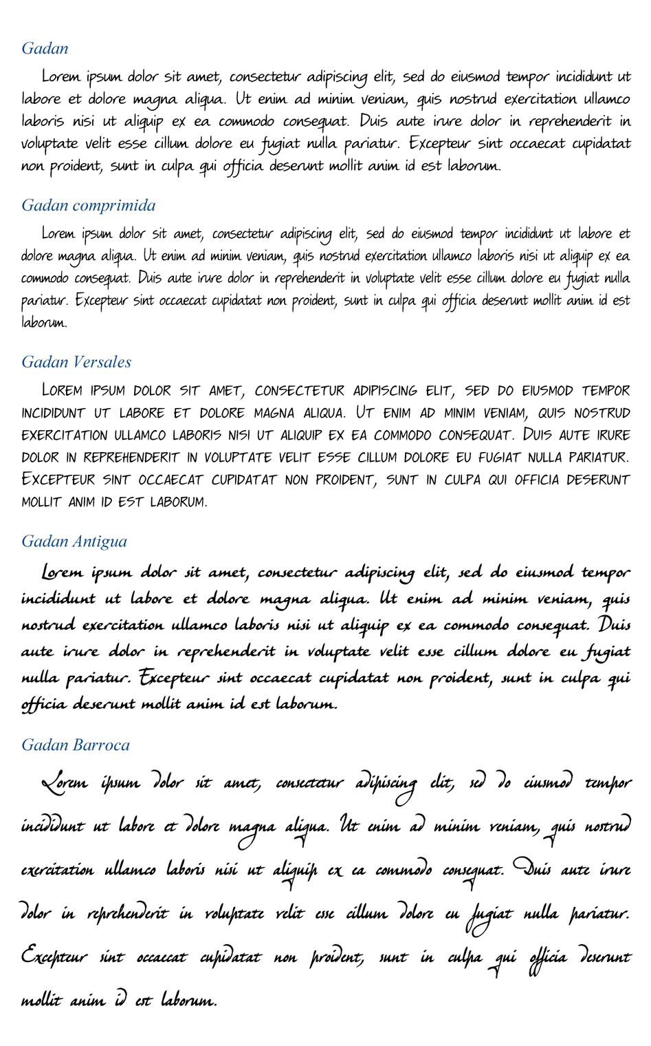
Gadan:
More than a font itself, it is a whole “family” of them, made up of a number of variants that include small caps, extra thicknesses and two types of nib writing. In all cases it reproduces my own calligraphy, so it is a handwritten style font and, therefore, suitable for more or less informal contexts. It was my first design.
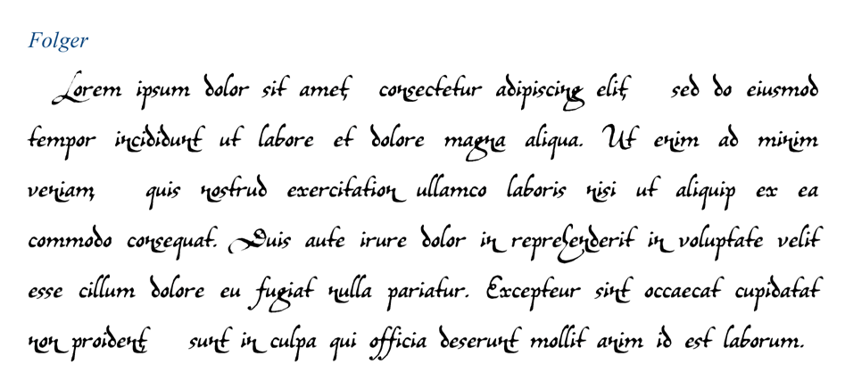
Folger:
With this other, what I wanted is to imitate the calligraphy of the Folger manuscript. It is probably the one that needs a more thorough revision, since the original is missing many characters that I had to replace with invented or transplanted lines with greater or lesser success, apart from the problem of its enormous decorativeness, whose richness is really difficult to condense into a simple computer font. Arguably, despite its age, it is still in ‘beta phase’.
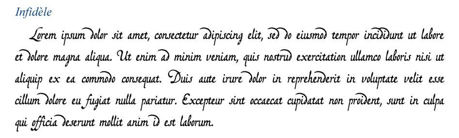
Infidèle:
Something similar happened when I set out to reproduce the writing of Sylvius Leopold Weiss’s Dresden manuscript, although in this case I did make a profound reform later, trying to minimize the differences between the two writing styles present in the original manuscript.
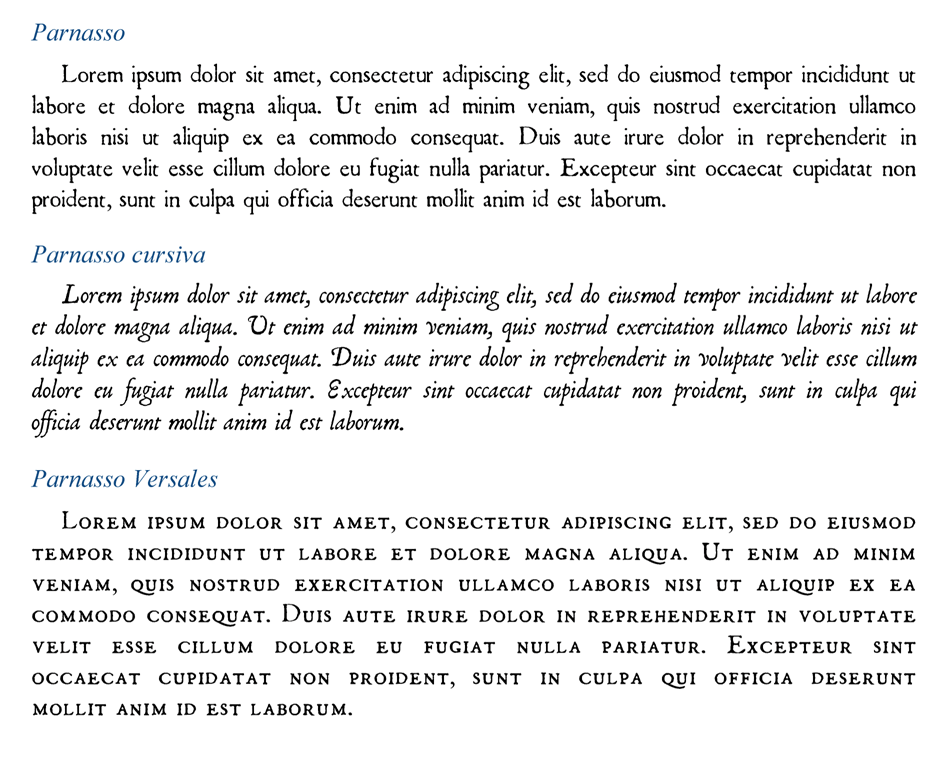
Parnasso:
It is probably the most successful of all — to say it humbly — and, without a doubt, the one that has had the most use. My intention was to imitate the typography of the homonymous book for vihuela by Esteban Daza, but as I was designing it, it turned out to actually become a kind of old-fashioned Garamond, based on a multitude of historical publications from different sources (I think I remember that I especially took advantage of a couple of English books). In other words, from El Parnasso it only keeps the name.
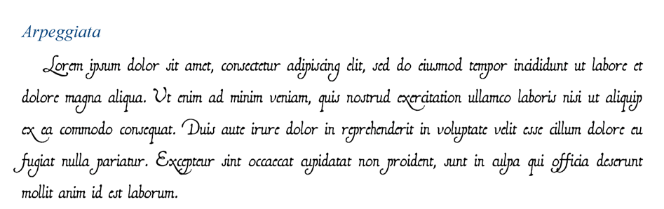
Arpeggiata:
This time it was Kapsberger’s turn, and again the problem arose of having to reconstruct a calligraphy starting from an incomplete alphabet. Although it was later revised to bring all its elements together, perhaps some minor retouching is still pending.
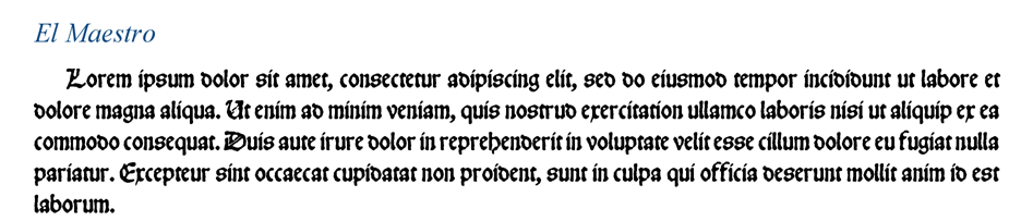
El Maestro:
One of the most showy, which follows the late round Gothic style, so common in those early 16th century printed books (it is not a handwritten script). In particular, the model is the book by Luis Milan, although I lacked having the complete alphabet of flowery capitulars, which I usually replace using the Camelot Initials, which is quite similar and free to use.
Charmes d’Orphée:
A thick handwritten script based on the Bodleian manuscript for baroque lute, although the title was stolen from Jacques Gallot’s celebrated piece. It lacks the elegance of other French scripts, but the homogenization work gave it a look, say, “improved”, which makes it quite showy and operational.
Rhétorique des Dieux:
A tribute to the beautiful and painstaking writing of Denis Gaultier’s book and, in part, that of Jacques Gallot, with an extremely elegant printed result. Highly recommended for this type of publication.
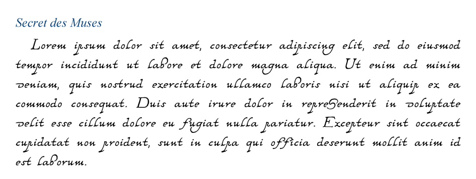
Secret des Muses:
In this case, the honoree is Nicolas Vallet, with his characteristic and precious handwriting of curved profiles and threaded shafts. Very effective
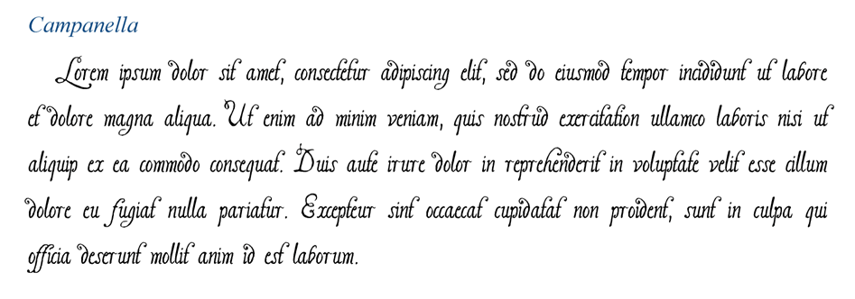
Campanella:
One of the most original, whimsical and ornamental of the entire collection, which follows the peculiar style of David Kellner’s book for baroque lute.
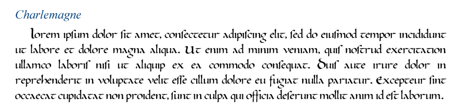
Charlemagne:
Something like a model of classical Carolina writing, which is the one that prevailed in much of Europe until the arrival of the Gothic system. Logically, it is only suitable for contexts very different from lute music.
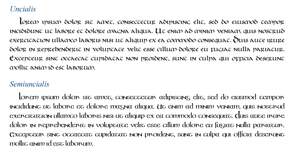
Uncialis:
Still further back in time, we go back to the typical Roman script of the low-imperial age, which would serve as the basis for all the “Celtic” ones developed during the High Middle Ages.Semiuncialis:
Derivation of the previous one that was in force in the early medieval codices, but endowed with a less solemnity and with a somewhat more cursive character.
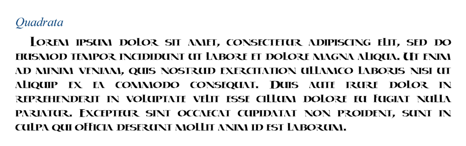
Quadrata:
Manuscript adaptation of the Roman square capital, characterized by its strict formality and rugged appearance.
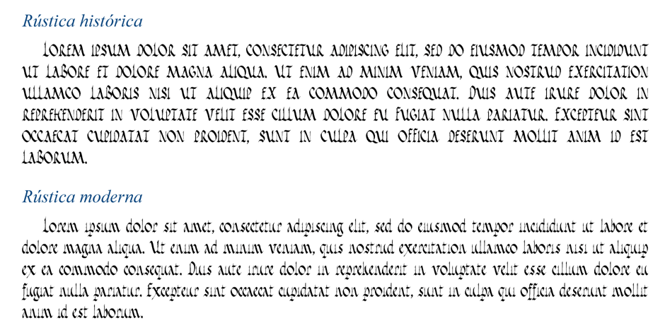
Rústica:
Contrary to the quadrata, the rustic would be equivalent to the other classical Roman capitalization system, but with a more informal and less ceremonial aspect.
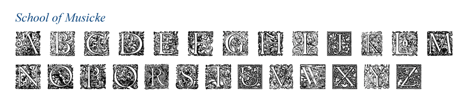
Schoole of Musicke:
It is the name given to my collection of decorative and historiated capitulars, most of them extracted from the publication of Thomas Robinson, although complete with other disparate sources.
Adornos históricos:
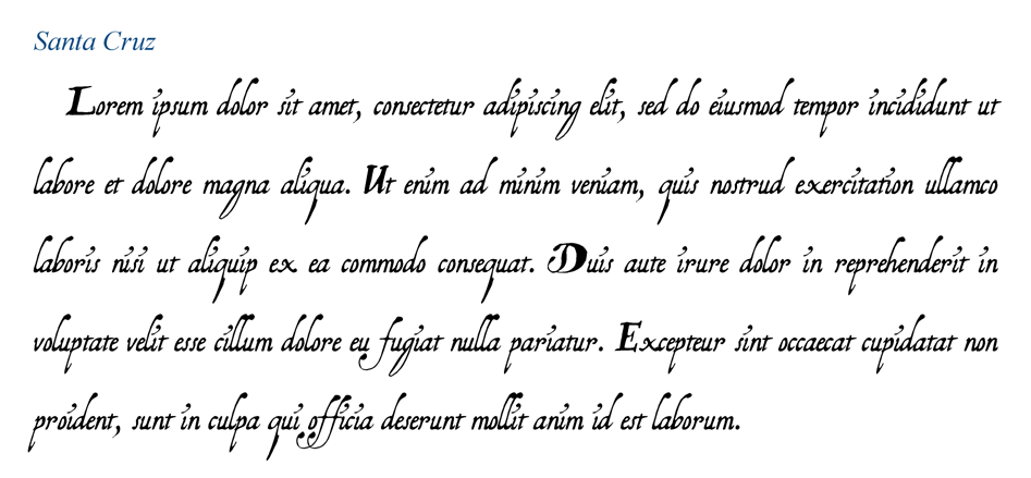
This font acts as a kind of catchall where I store all those ornaments that I have not been able to insert in the previous fonts, such as leaves, stems, bows or borders.Santa Cruz:
The penultimate font that I have been able to design tries to transpose the very personal writing of the famous baroque guitar book, with very robust capital letters and highly stylized lowercase italics.
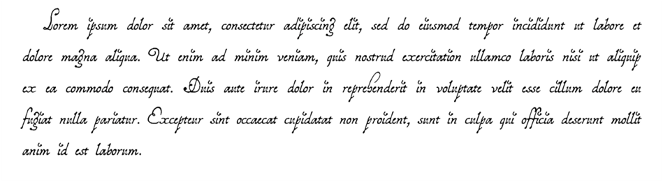
Saldívar
A beautiful font in honor of the calligraphy of Santiago de Murcia, which, once regularized, has turned out to acquire a certain touch of additional elegance, especially in really showy capital letters.
And so far the relationship, waiting to be able to materialize other projects that at the moment I only have in mind, although in parallel to the design of these fonts I have also been making adaptations of them (and additional creations) for the two main editing programs of tablatures, the Django and the Fronimo.
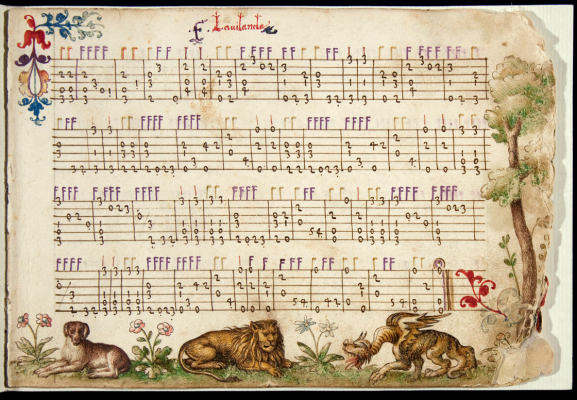
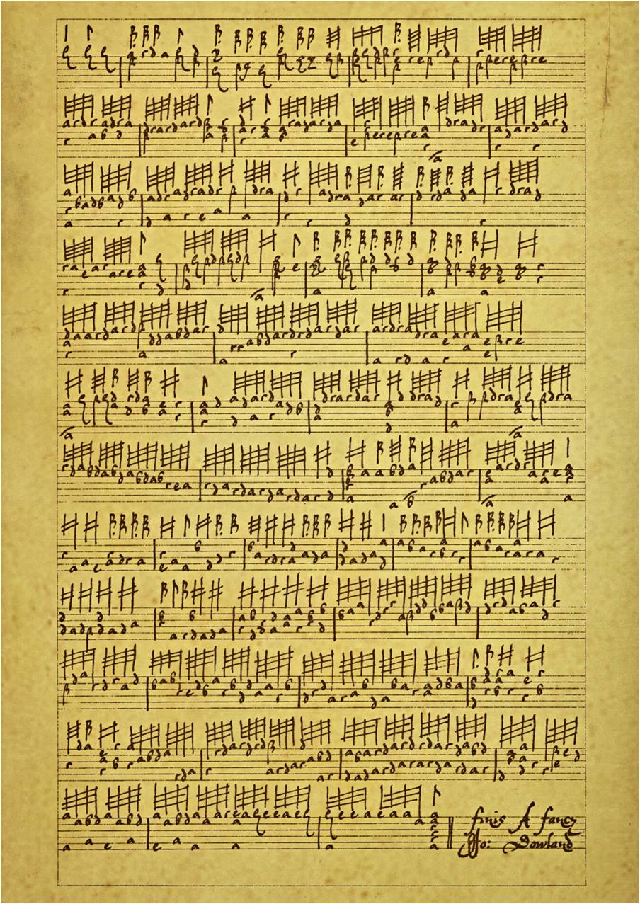
David, when was this hobby born? Have you had any references or drivers to develop your work?If I had to choose a moment as the starting point of this hobby, it is possible that everything derives from a conversation that Javier Hervás and I had during the course that Patt O’Brien taught in Gijón in 2002. Already at that time I had tried to create my first writing style of my own to edit tabs my way, although I still did it by hand drawing pen and sepia ink on carefully aged, lined paper (the following image of Dowland’s fantasy imitating Folger’s manuscript sums it all up ).
Knowing this, Javier told me about a manuscript of baroque music that, after having survived a fire and other vicissitudes, could be calligraphically reconstructed and subsequently published.
The truth is that we never agreed to carry out the project (possibly due to lack of time, given the insistence with which I proposed it) and I do not even have the exact reference of the battered manuscript, but the truth is that thereafter, convinced that at least this way I could edit any tablature much faster without completely renouncing the beauty of the old, I set out to design the necessary fonts to reproduce the writings of the Folger and Dresden manuscripts, which were the that first came to my hands.
In addition, Patt himself provided all the students with a large corpus of facsimiles of books for baroque lute that only added fuel to that dream of publishing old-fashioned tablature.
After so many hours invested, with such meticulous and delicate work, you are a privileged connoisseur of all the secrets of each typeface. Which of them would you choose? Which one is your favorite?It is difficult to stay with just one of the fonts or handwritten styles that run through the more than two hundred years of history of lute tablature, but there are undoubtedly certain milestones that are very difficult to overcome in beauty. The book by Capirola probably occurs to me, with those exuberantly minified margins and those beautiful examples of Italian humanistic writing: without a doubt, the perfect example to convert into a font, especially since it has that broad introduction from which to extract the almost complete alphabet. But it also seemed essential to me from the beginning to adapt the unmistakable style of the Milan book, really colorful in the profuse headings of the pieces thanks to the almost “textile” aspect that the density and tightness of the Gothic characters give. In general, I enjoy more the challenge of transplanting the wide and variable lines of handwritten books to the single cells of the typographic system, but since it is still an inconvenience to have to reduce the graphic richness of the original, I have also learned to value those other constructed fonts. based on historical fonts that functioned – and do work – with enormous clarity of reading, thus prioritizing the effectiveness of movable type over the decorativeness of manual writing: these would be, for example, the cases of the books by Da Milano, Robert Dowland , Antoine Francisque or Robert Ballard, which, with the lute already in hand, offer an incomparable ease of reading (in the case of Spaniards, in my opinion the types that work best are those used in the books by Daza, Pisador and Valderrábano). But going back to handwriting, apart from the Folger and Dresden manuscripts I would perhaps highlight, in French territory, that of Milleran for its preciousness and the books of Denis Gaultier and Jacques Gallot for its elegance; in Italy, those of Gianoncelli and Zamboni; in Spain, those of Santa Cruz and Murcia, and in the rest of Europe, those of Vallet and Kellner, although my choice is still somewhat arbitrary for too short.
Finally David, how do you think fonts evolved during the life of the plucked string?The fact of abandoning the printing press in favor of manual writing was a trend towards the ornamental that turns certain manuscripts into true works of art. But I also think that this “primitive” system gave the earliest books a charming aspect that made them different and it is a delight to reproduce (and also with greater fidelity). Although, as I say, for me nothing is comparable to that imaginary scene on the desk where, in the light of a lamp, I can almost hear the friction caused by the calligrapher’s pen as it crawls on the rough paper that will support the music.
David, thank you very much for your valuable work, your excellent disposition and the time dedicated to this interview.